The Unison brand
Unison is a dating service built on imprint: the subconscious image of a partner a person already carries. This page has everything needed to speak about the brand consistently — in articles, ads, apps and partner materials.
PNG files are ready to use. For print, interviews and unusual layouts, write to us.
What the name stands for
Unison is a musical term: two voices sounding at the same pitch. In the brand it is a metaphor for meeting someone you resonate with. Not "matching interests" — sounding together.
The product mechanics are imprint. It is the subconscious image of an ideal partner formed in childhood that keeps shaping a person's choices later in life. Unison turns that image into parameters and looks for people who fit it. No profiles feed, no swipes: a dialogue with AI and a few precise introductions instead of endless choice.
Two words carry the whole communication: "imprint" is the mechanics, "goodbye, swipes" is the refusal of the old way of dating.
«Goodbye, swipes»
Capital G, comma after "Goodbye". No full stop in headlines; normal sentence punctuation in body text. The tagline is never declined, shortened or translated word-for-word into another slogan.
The name
The name is written in Latin script, capitalised, without quotation marks and without translation. It is a proper noun: "in Unison", not "the Unison app brand".
- Unison
The only correct spelling in any language and context. "Unison is a dating service built on imprint."
- UnisonDatingBot
Technical name of the Telegram bot. One word, Latin script, no spaces, no @ in body text.
- UNISON
All caps belongs to the logo only. Never in body text, headlines or ads.
- Unison App, Unison Dating App
The product is Unison. Words like "bot" and "app" are lowercase and separate: "the Unison bot", "the Unison app".
- "Unison" in quotation marks
No quotation marks: it is a proper name, not a term.
- Unison dating agency
We are a service, not an agency: nobody matches people by hand.
Logo
The logo is a mark plus a wordmark. The mark is two rounded shapes, blue and pink, with a black square where they meet: two voices converging at one point. The wordmark "Unison" is set in Space Grotesk with tight tracking.
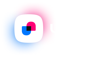
Primary logo
Mark and wordmark. For the website, covers, decks and partner materials on dark backgrounds.
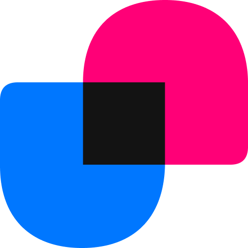
Mark
Without the wordmark. On a light plate — for avatars, section icons and cases where the brand name already appears next to it. On dark backgrounds the mark sits on a white tile, as in the primary logo.
Required rules
- — Clear space — at least half the mark height on every side. No text, frames or other logos inside it.
- — Minimum width: 120 px on screen and 30 mm in print for the primary logo; 24 px and 8 mm for the mark.
- — Backgrounds are flat only: #000E23, black or white. On a light background the mark sits on a plate, never on a photo.
- — Scale the logo as a whole: the proportions of mark and wordmark never change.
- — On dark backgrounds use the version from the brand kit — glowing, with a white wordmark.
What we don't do
- — Don't stretch or squeeze the logo.
- — Don't recolour the mark into a single colour — only an approved monochrome.
- — Don't rotate, skew, or add shadows, outlines and gradients.
- — Don't place the logo on photography or a busy background.
- — Don't separate mark and wordmark at will or reset the name in another typeface.
- — Don't add taglines, frames, emoji or UI elements to the logo.
Partners and media may use the logo in materials about Unison without separate permission — as long as it does not look like your own brand and a link to unison.dating is nearby.
Colour
A dark base with blue and pink as the two voices of the brand. Blue is interface and primary accent; pink is the second voice, used only for accents and paired elements.
Roughly 70% of a layout is the background #000E23, 20% is the surfaces #001839 and #0A1F42, 10% is blue and pink. Pink is never used for large buttons and never takes more than a tenth of the layout: its job is to mark the second point, not to pull focus.
Typography
Two typefaces, both under the SIL OFL licence: free to use in partner and media materials.
Space Grotesk
HeadlinesInter
BodyOn the web both fonts load from Google Fonts. For print and decks, download them free from their authors.
Brand voice
Unison speaks calmly and to the point. We explain the mechanics instead of promising miracles: imprint is a concrete idea and can be described precisely.
We say
- — "Matching by imprint" — that is what the mechanics are called.
- — "Goodbye, swipes" — that is the refusal of the profile feed.
- — Specifics: what happens after the bot starts, how long the path to a meeting takes.
- — Honest limits: the service narrows the choice but does not guarantee a relationship.
We don't say
- — "Compatibility by interests and values" — that is a different mechanics, not ours.
- — "Find love in a week", "100% match", "destiny algorithm".
- — "Psychological test" — imprint is not a test or a questionnaire.
- — Result promises and other people's stories offered as proof that it will work for you.
In advertising we never promise relationships and never belittle people who use other dating services.
Files
PNG logos with transparent backgrounds plus a favicon. Vector files (SVG, AI) are available on request — for print, outdoor and merch.

Logo, mark, favicon and a palette memo in one archive, 51 KB.
Brand questions
Short answers to what editors and partners ask most often.
Can I use the Unison logo in my article or video?
Can I change the logo colours?
Is there a vector logo?
Is Unison about compatibility?
What does the tagline "Goodbye, swipes" mean?
Approvals and requests
Brand usage questions, layout checks, vector files and interviews — one address:
We reply on business days. For press, put "Press" in the subject line to get a faster answer.